We were commissioned with this project to produce a full brand identity and online presence for an authentic Juice and Coffee bar, a stone's throw away from Leicester Square, in Soho London
Solution
The solution was to create a brand and online presence of quality and substance that could align with business realities amongst the fierce competition in central London - A brand that reflects the way they do business and how they're set up
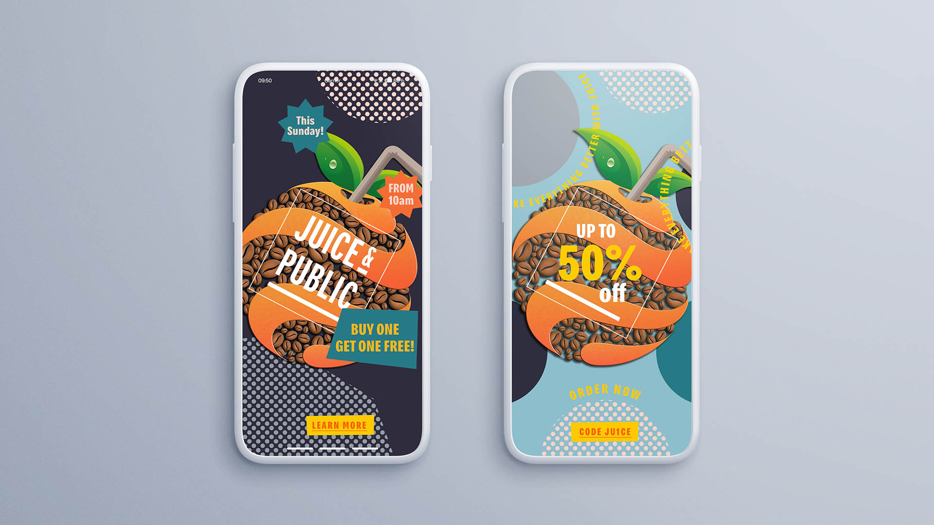
Deliverables – Brand positioning / Brand Identity / UI UX Web Development / Print design
Brand Identity
LOGO / BRANDMARK
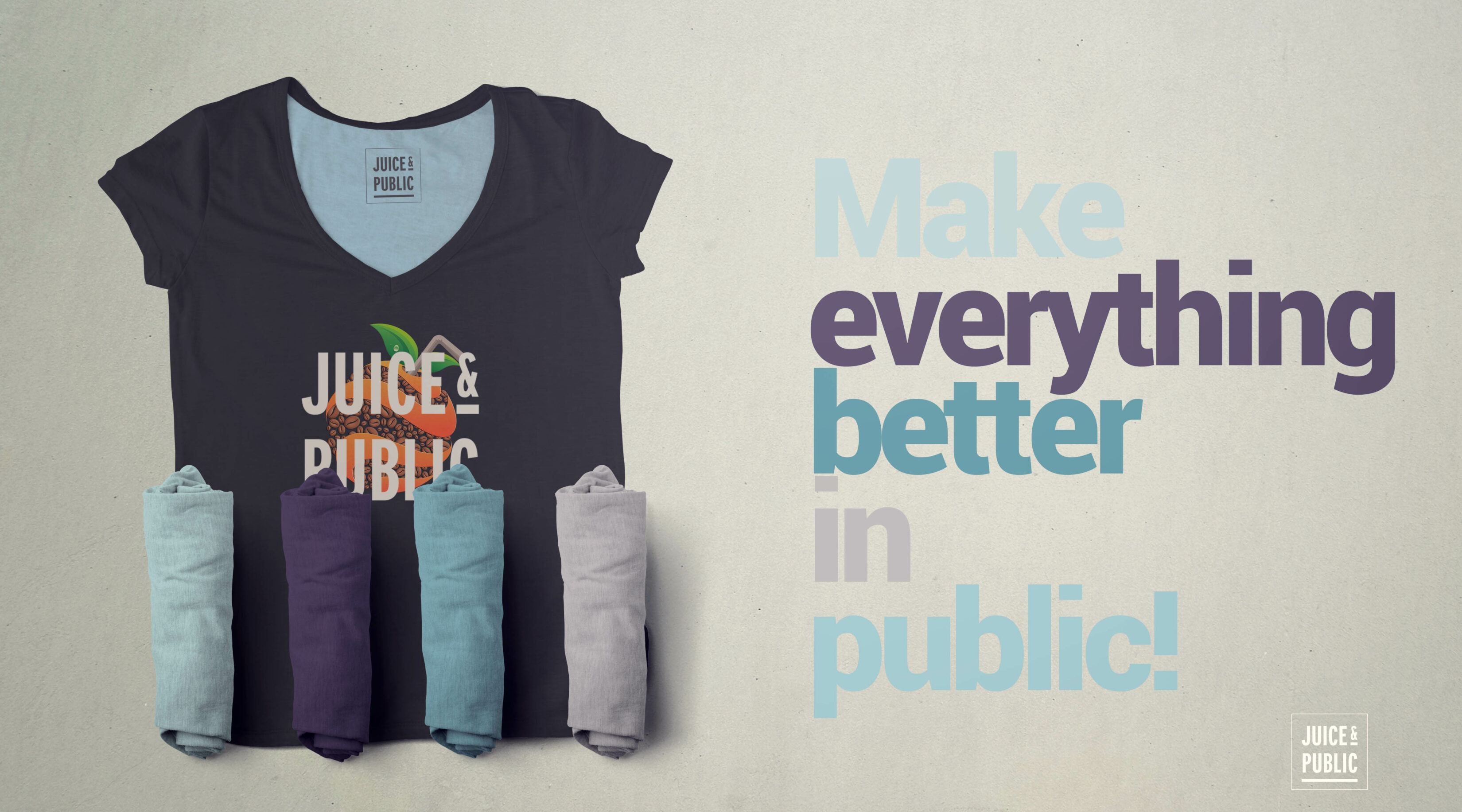
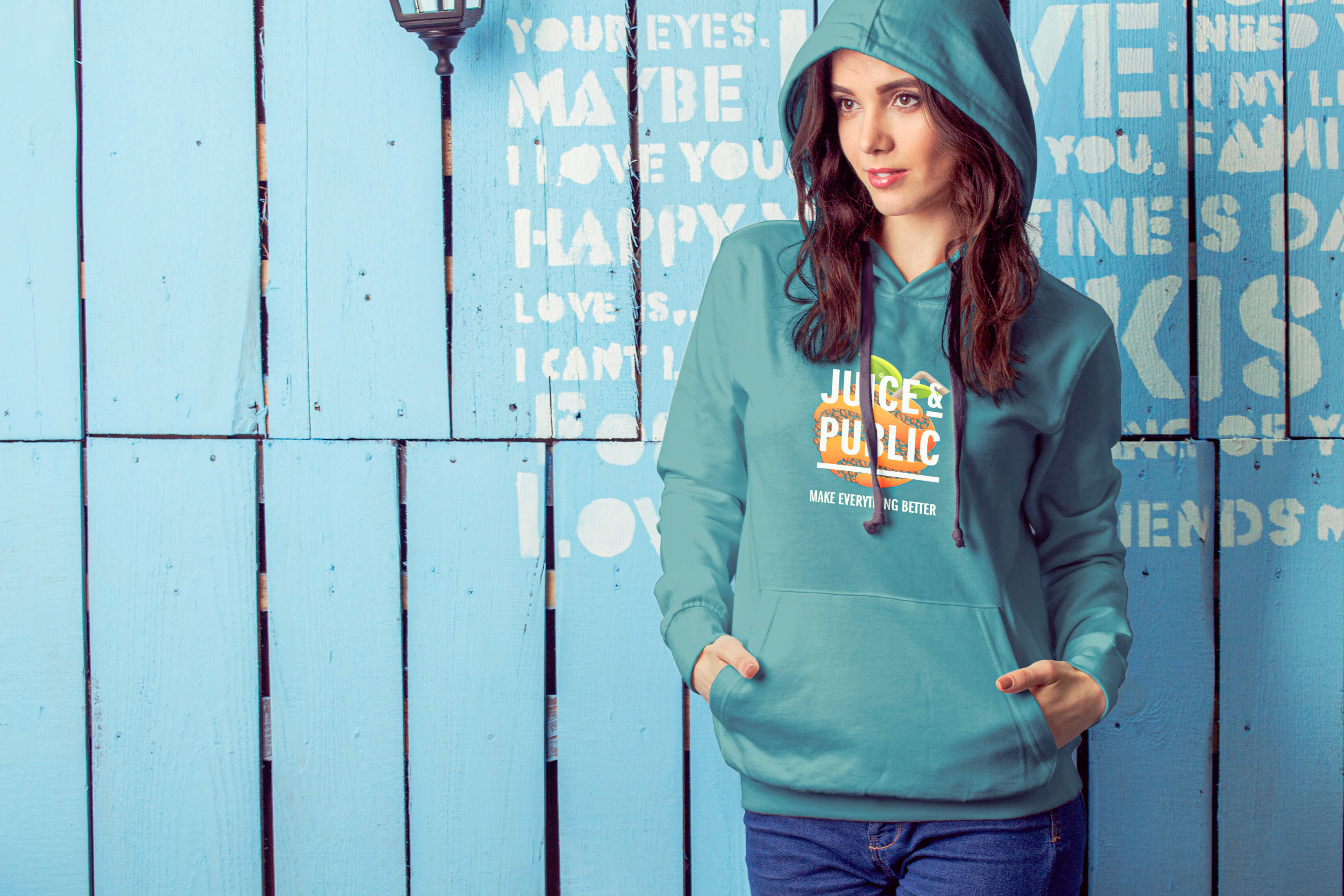
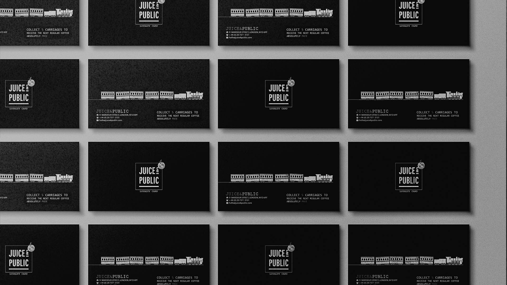
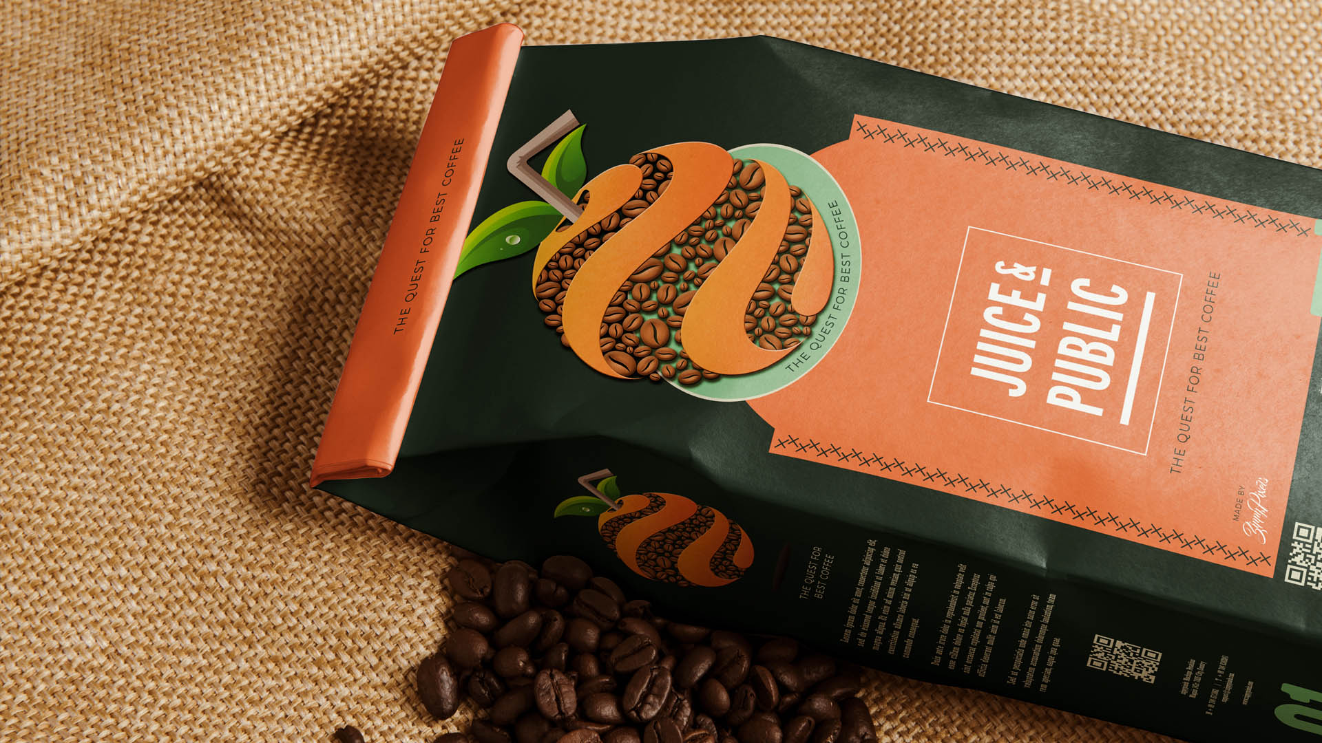
The branding consists of the logo with multiple layout variations to work in uniformity across the range of mediums required for the business – Whilst keeping the core design bold and defined against the backdrop of the brand colours and accompanying design material
We chose Franklin Gothic Pro as the primary font family for its demanding, bold and legible, stand out presence and its historical unity with the former times of Soho London – Drawing upon its go-to typeface for display and trade use since 1940 and founding style of the earlier nineteenth century
Typography
We chose Franklin Gothic Pro as the primary font family for its demanding, bold and legible, stand out presence and its historical unity with the former times of Soho London – Drawing upon its go-to typeface for display and trade use since 1940 and founding style of the earlier nineteenth century
Primary
Ag
ITC Franklin Gothic LT Pro Demi Compressed
ABCDEFGHIJKLMNOPQRSTUVXYZ
The quick brown fox jumps over the lazy dog
Secondary
Ag
Bruta Pro Compressed Bold
ABCDEFGHIJKLMNOPQRSTUVXYZ
The quick brown fox jumps over the lazy dog
Brand colours
Pantone 550 C
C: M: Y: K: 49, 12, 19, 1
Pantone 532 C
C: M: Y: K: 81, 74, 19, 55
Pantone 5473 C
C: M: Y: K: 80, 32, 38, 16
Pantone 7544 C
C: M: Y: K: 45, 32, 27, 8
RGB / HEX
Legibility
The identity was shaped by drawing upon Franklin Gothic's go-to typeface style for display and trade use since 1940 and the founding form of the earlier nineteenth century
The result was a well-orchestrated brand and web development campaign with clear and present brand messaging and signage accented with neutral brand colours and a vibrant professional portfolio of promotional product placed images and accompanying graphic design
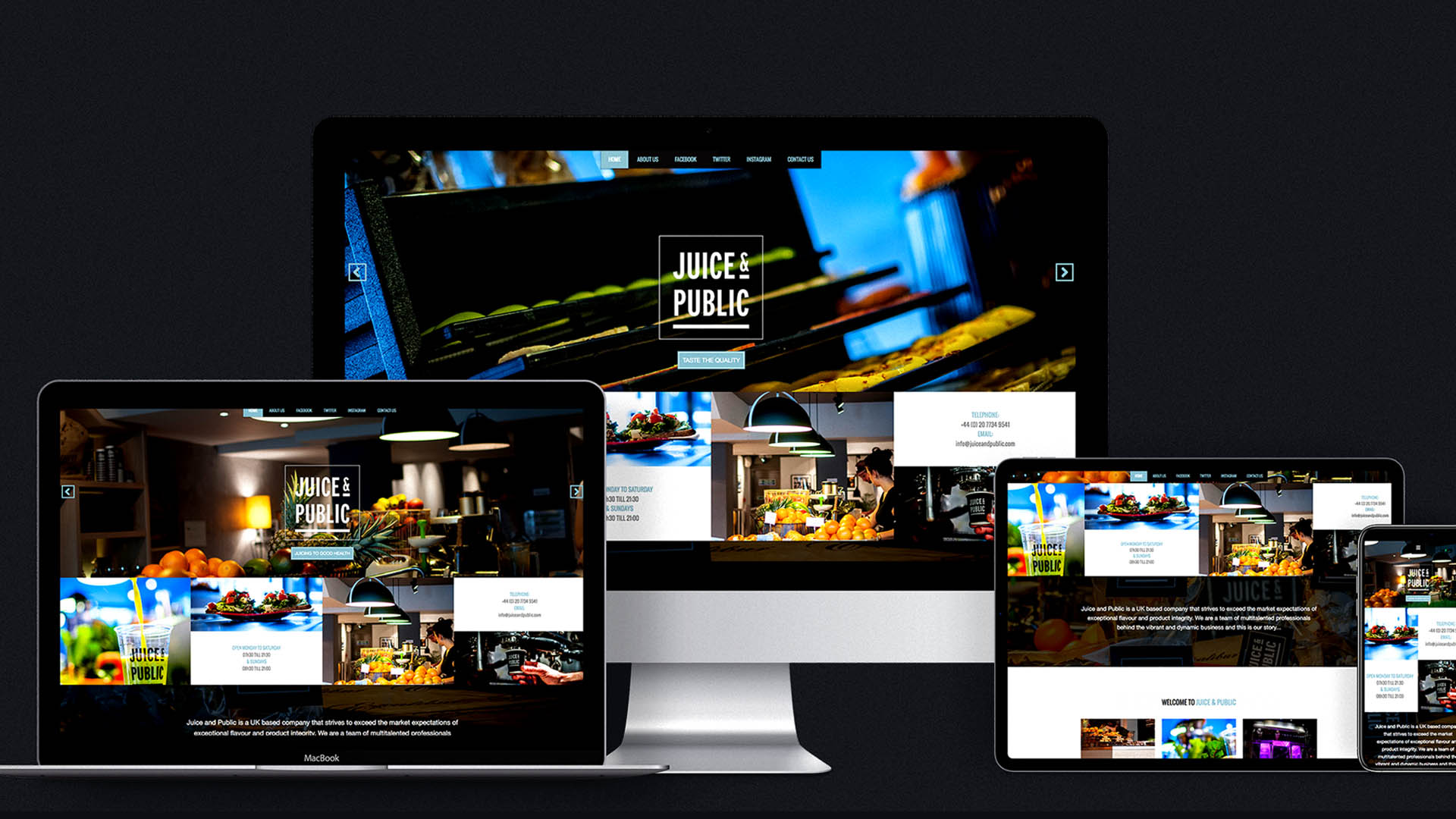
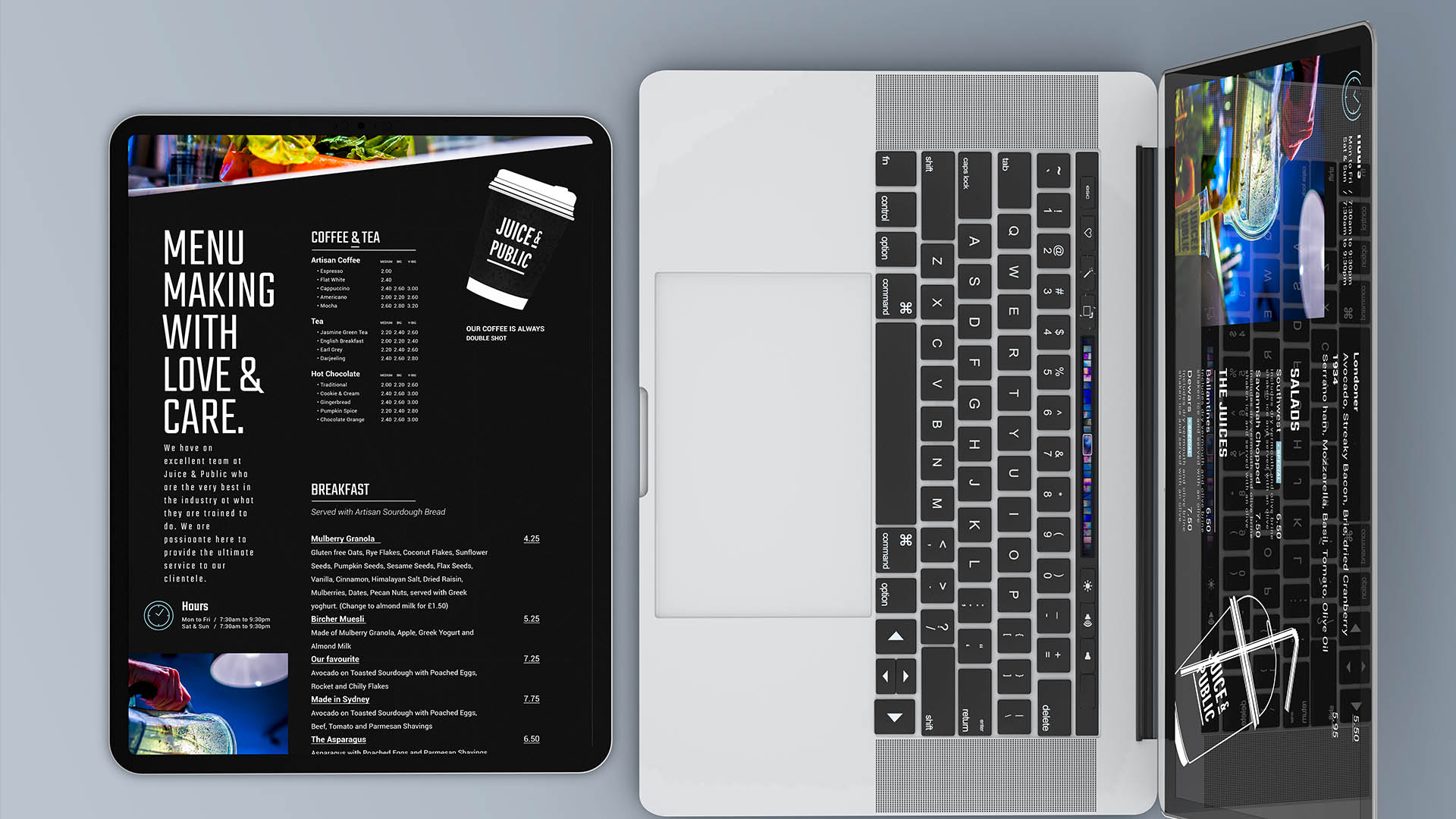
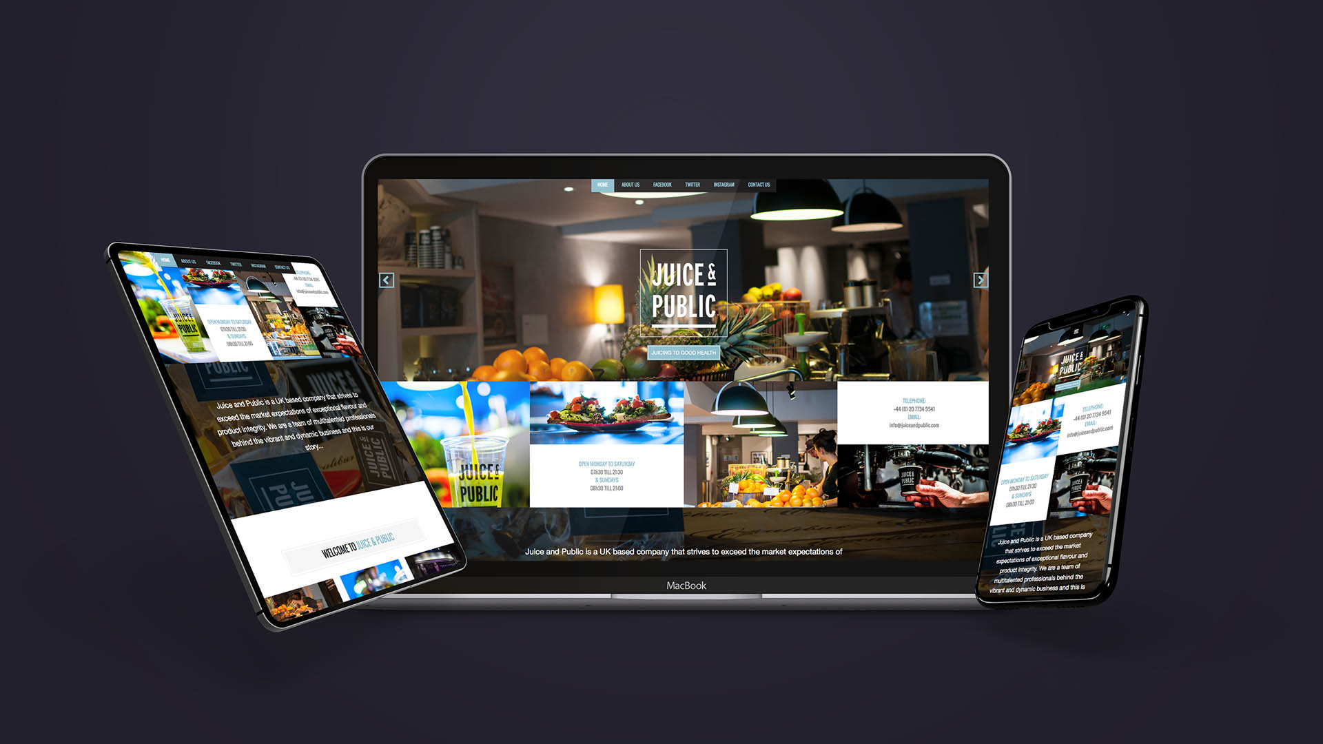
Web Development
Visual Identity
There's nothing more powerful in the world than a great story - Let's tell yours!
Creative Direction, Design Direction, Research & Strategy, UI UX Web Development, Design Development