The objective was to create a modern brand, with rooted historical, technical and informative design characteristics portraying the customer's long-lasting heritage and established presence in their field
Solution
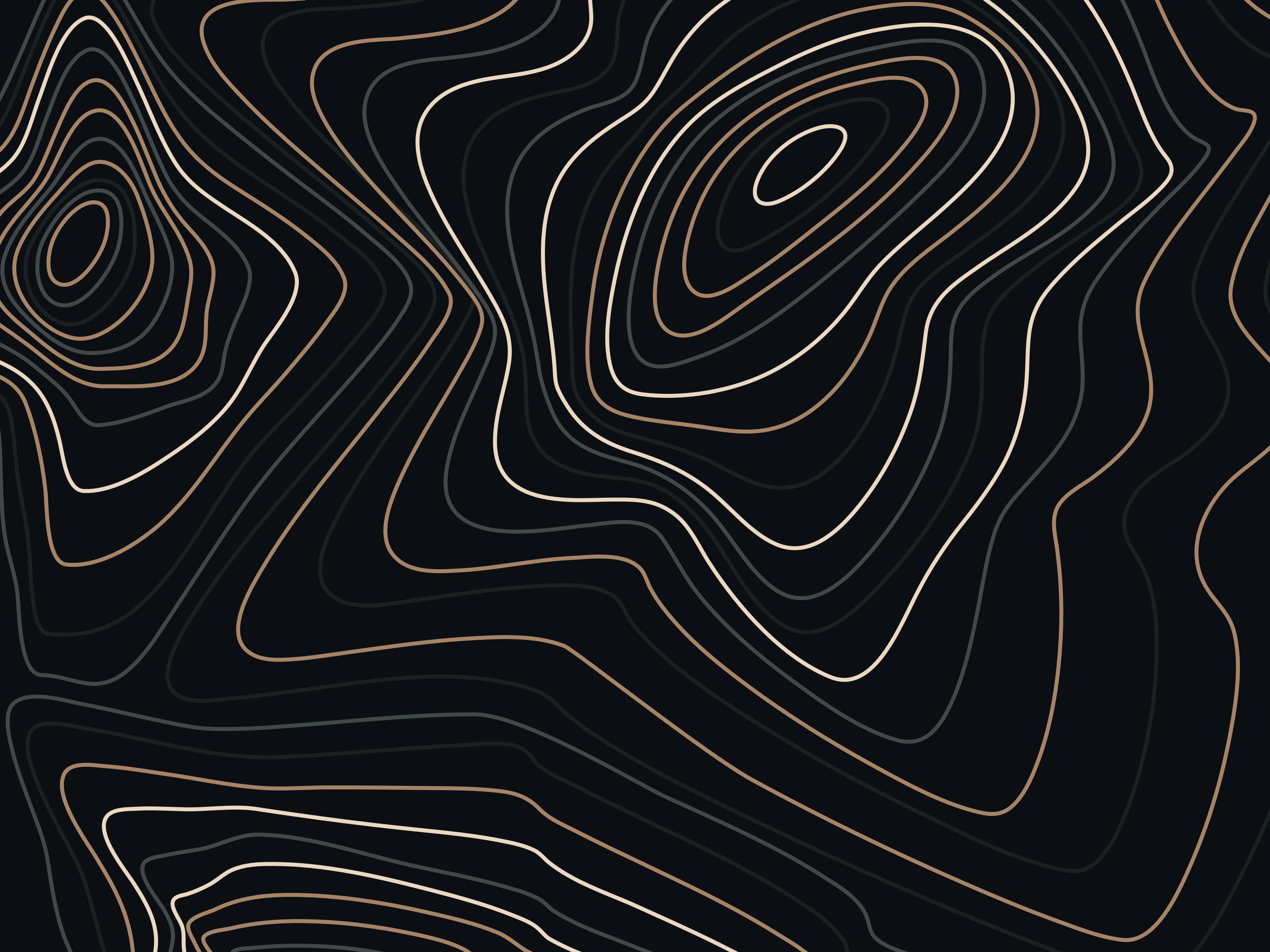
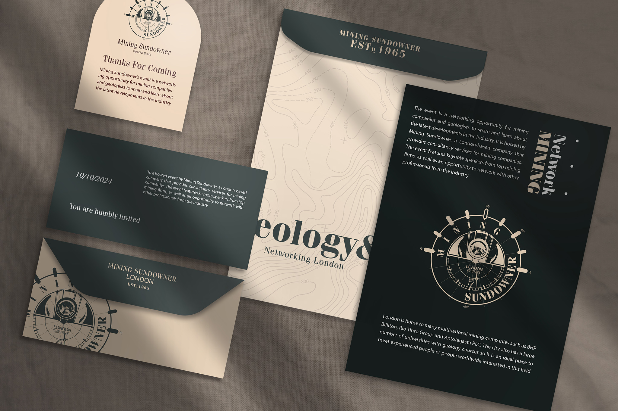
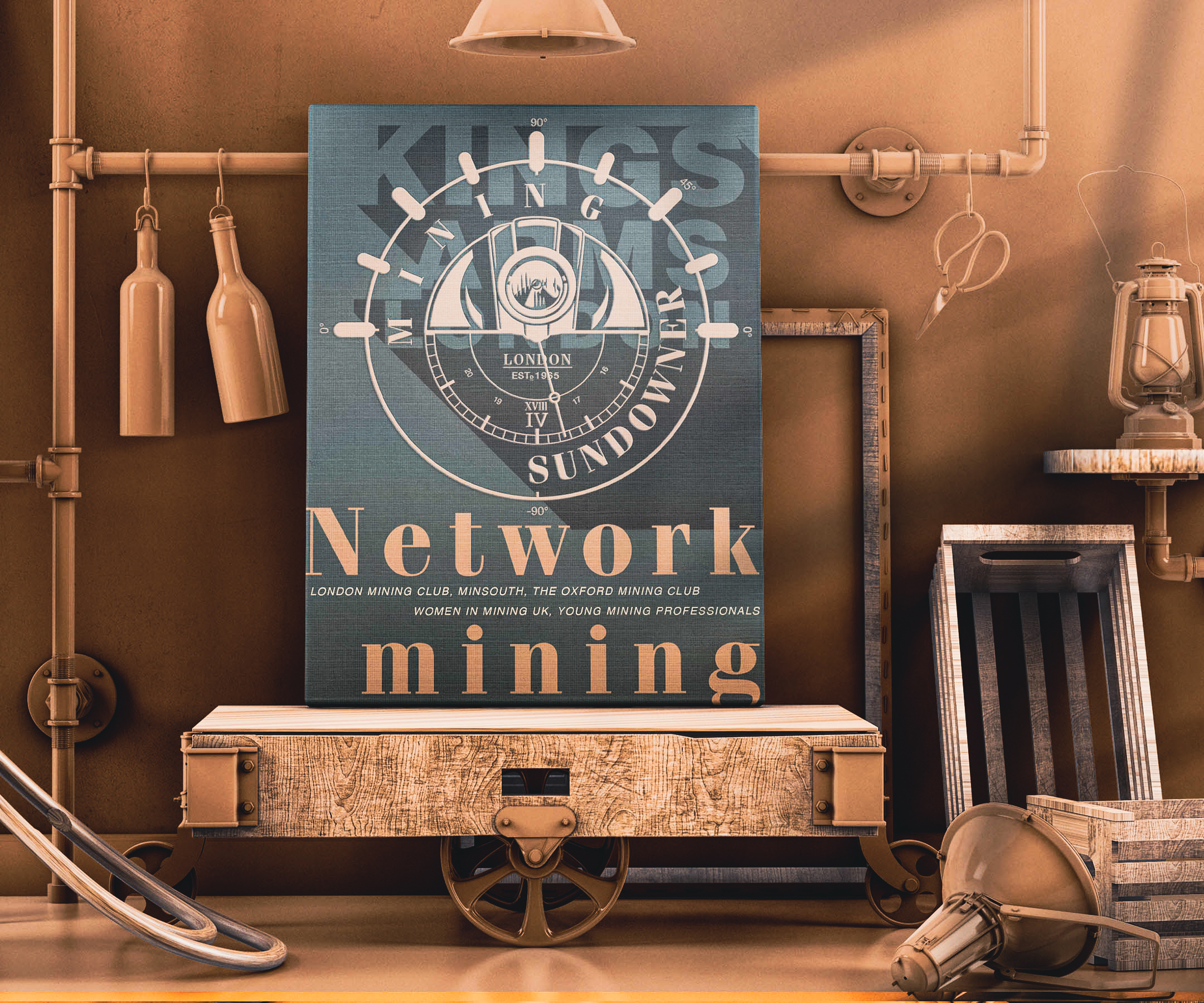
The concept was to build a brand that used geological references and brand messaging, all derived from a relationship to nature, time, and the organisation's strong connection with the mining industry
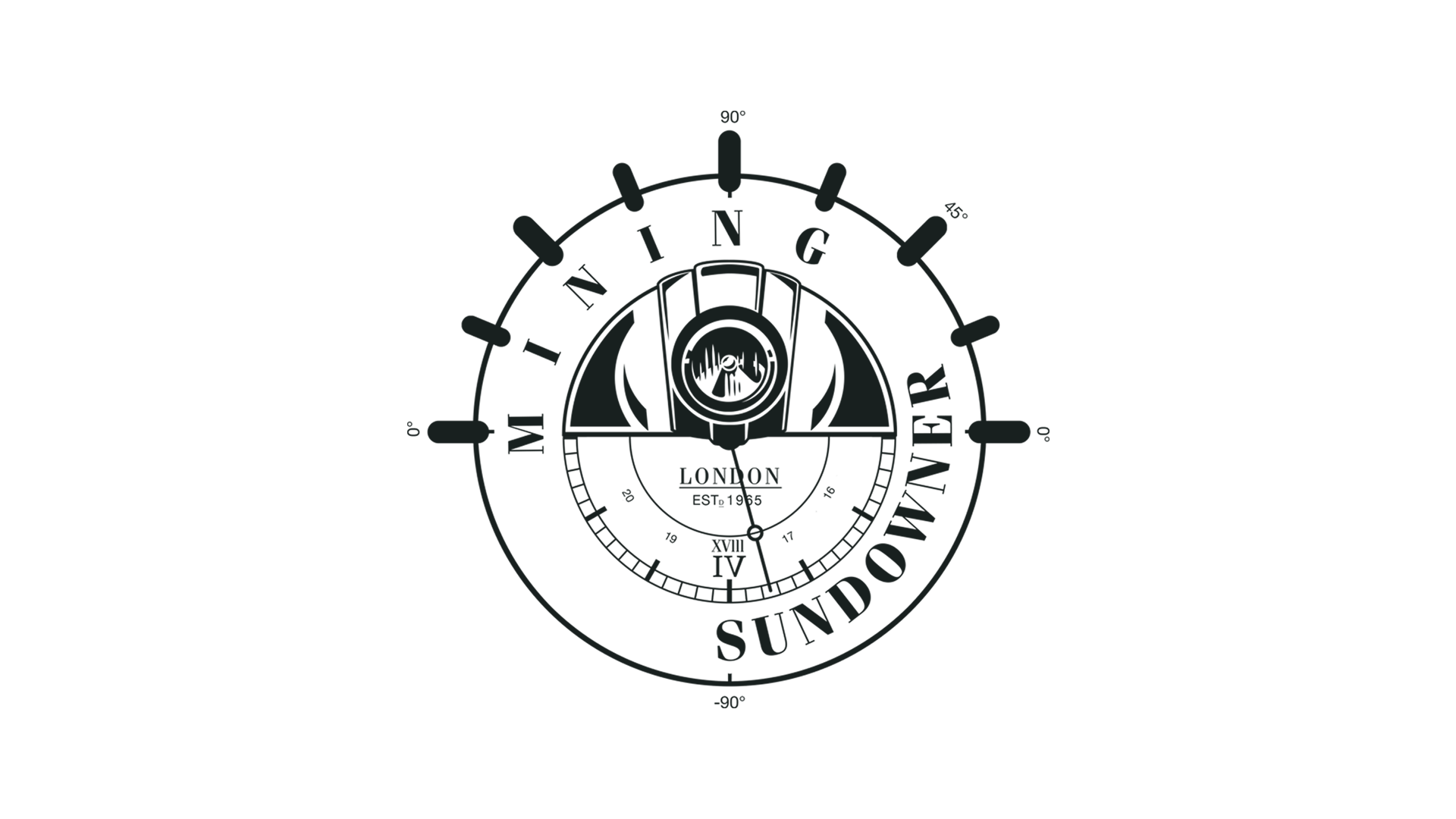
The main logo was designed to embody the message behind the naming of the organisation. The outer watch dial is in reference to the sun setting – The inner dial incorporates the design of a miner hard-hat and lamp, completing the sun. The watch face inspired element depicts the time that the events will commence each month, the broad location and the year the organisation was founded
We chose to use two font families for the main branding – One for the naming and one for the elements of design detail throughout. Fenice Pro and Helvetica were two font families that gave us the option to use both modern and historical typefaces that complement each other, and the message
Typography
We chose to use two font families for the main branding – One for the naming and one for the elements of design detail throughout. Fenice Pro and Helvetica were two font families that gave us the option to use both modern and historical typefaces that complement each other, and the message
Primary
Ag
Fenice Pro ITC Bold
ABCDEFGHIJKLMNOPQRSTUVXYZ
The quick brown fox jumps over the lazy dog
Secondary
Ag
Helvetica Neue Regular
ABCDEFGHIJKLMNOPQRSTUVXYZ
The quick brown fox jumps over the lazy dog
Brand colours
Pantone 419 C
C: M: Y: K: 80, 62 62, 79
Pantone 446 C
C: M: Y: K: 70, 51, 54, 51
Pantone 4645 C
C: M: Y: K: 25, 49, 62, 16
Pantone 719 C
C: M: Y: K: 8, 17, 28, 0
RGB / HEX
Legibility
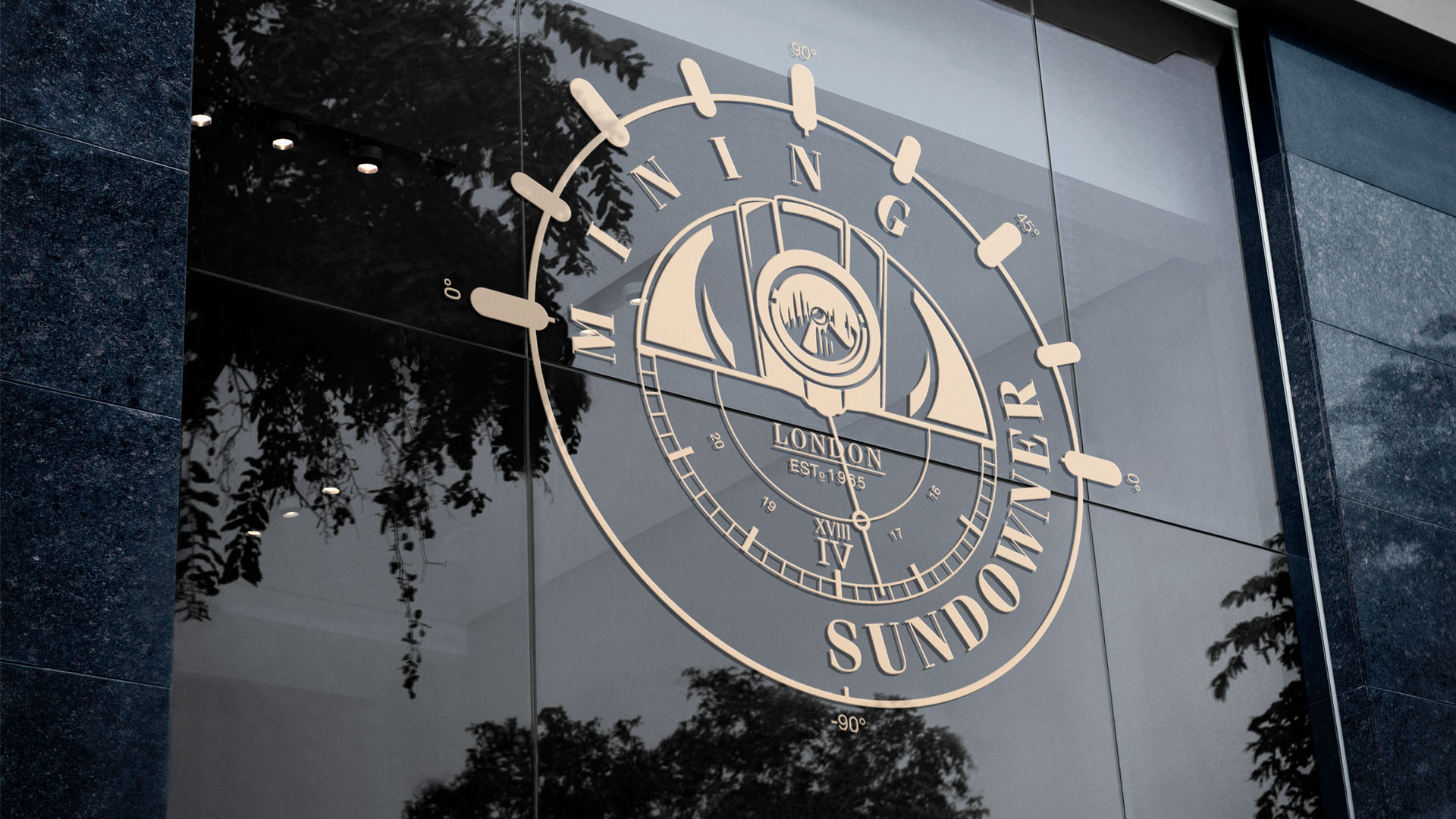
The identity was shaped by the company's core message, direction and values. The references to time and mining are deep-rooted in geology and serve as a clear message to their target audience
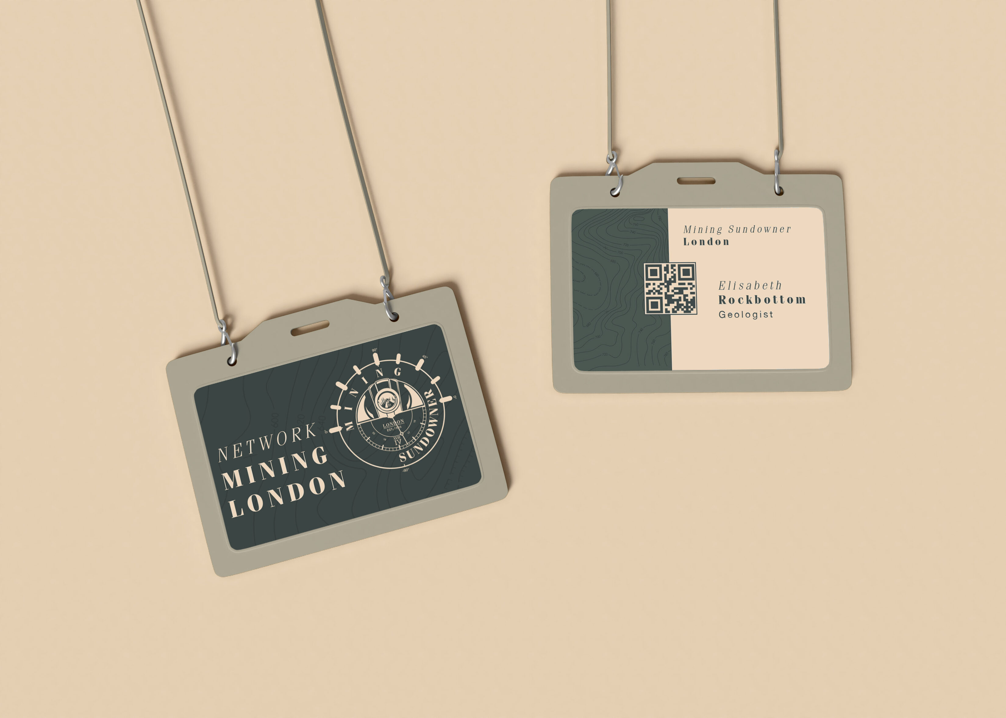
The final result is an informative brand with very clear intentions and a distinctly earthy colour palette to match
Visual Identity
We build digital products that people love to use
Creative Direction, Design Direction, Research & Strategy, Design Development